I Haven't Opened Canva in Six Months
Canva is fine. I'm not here to trash it. But somewhere around September last year, I stopped opening it entirely — and my Instagram content got better.
Not because I hired a designer. Not because I discovered some secret template pack. Because I started designing Instagram posts in HTML.
Yes. <div> tags. CSS gradients. width: 1080px; height: 1080px. The same tools I use to build websites. And it turns out that when your design tool is also your code editor, everything about content creation changes — speed, consistency, iteration, and the weird creative friction that makes most developers avoid social media altogether.
Here's the entire pipeline. No theory. Just the actual workflow I use every week.
The Stack
| Tool | Role |
|---|---|
| Claude Code | Content planning, HTML generation, image handling |
| HTML + CSS | The "design tool" — a plain .html file rendered in a browser |
| Playwright | Screenshot automation — renders HTML to 1080x1080 PNGs |
| Figma MCP | Bridge between code and Figma for polish and adjustments |
Four tools. Zero subscriptions to design platforms. The total cost of this pipeline is whatever Claude Code costs you — which you're already paying if you're reading my blog.
Step 1: Plan the Content With Claude
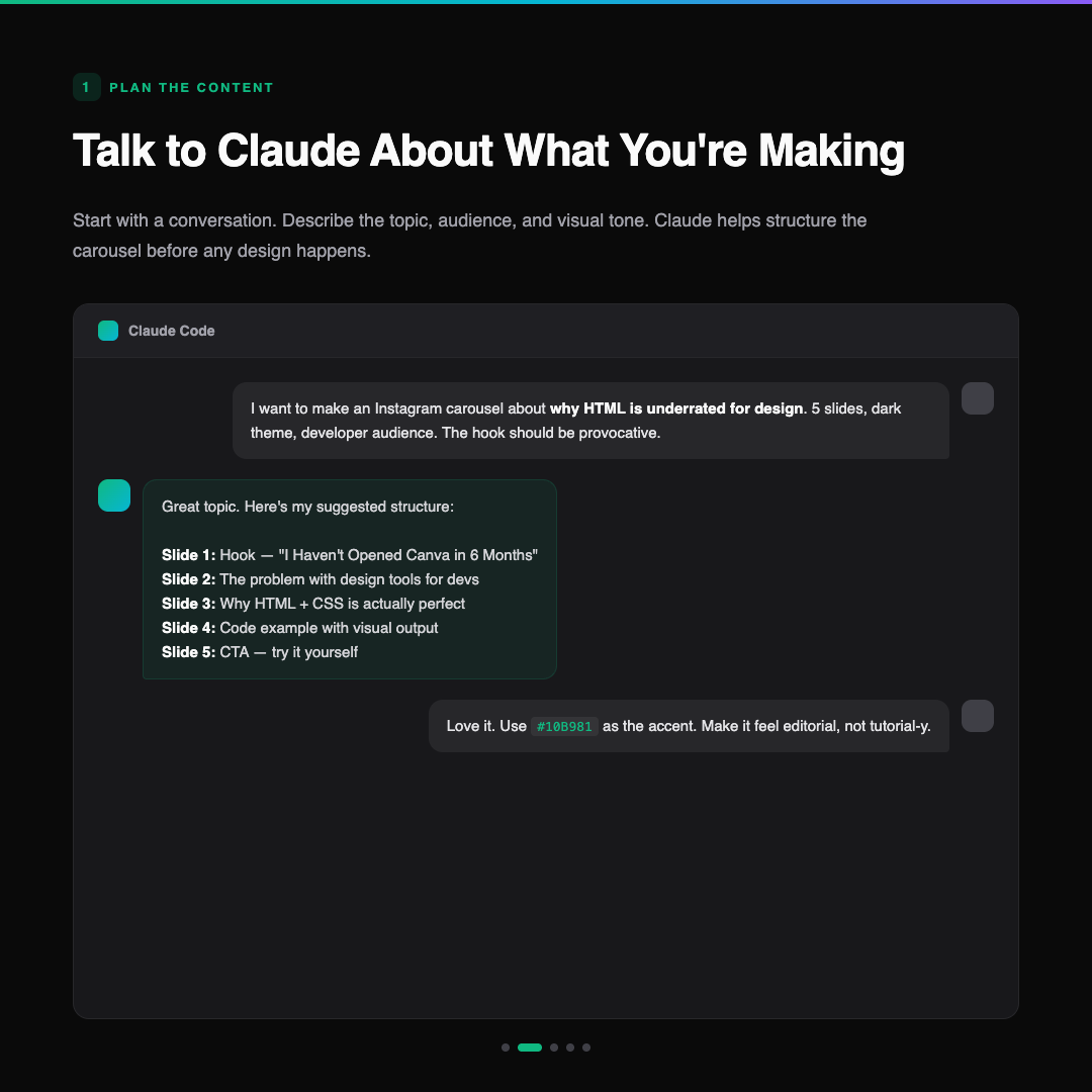
Every carousel starts as a conversation.
I don't open a blank HTML file and start typing <div>. I open Claude Code and describe what I want to make. Topic, audience, number of slides, visual tone, even the emotional arc of the carousel. Claude is not just generating code here — it's an editorial partner.
A real example:
"I want to make a 5-slide Instagram carousel about why I use HTML instead of Canva for Instagram design. Dark theme, developer audience. The hook should be bold and slightly provocative. The last slide should have a clear CTA. Use my brand accent
#10B981."
Claude comes back with a content structure — slide-by-slide breakdown, suggested headlines, narrative flow. We go back and forth. I might say "slide 3 needs a code example next to a preview" or "make the CTA less aggressive, more 'save this for later' energy."
This is the part most people skip. They jump straight to the design. But a carousel with bad structure looks bad no matter how pretty the slides are. Get the content right first.
Step 2: Feed Claude Any Images It Needs
Sometimes a carousel needs more than text and shapes. Product screenshots, code editor captures, browser renders, logos.
The workflow here is simple: I take the screenshot (or grab the asset), and include it directly in the conversation. Claude can see images — it understands what's in a screenshot, where the visual emphasis is, and how to incorporate it into the design.
For the example carousel in this post, I didn't need external images. But when I'm making content about a specific project — say, a new feature in DropVox or a dashboard I built — I'll screenshot the actual UI and tell Claude:
"Use this screenshot as the hero image for slide 3. Add a dark overlay with the heading on top. Keep the screenshot visible but not overwhelming."
Claude writes the HTML with the image positioned exactly where it needs to be. object-fit: cover, border-radius, overlay gradients — all handled in CSS.
The key insight: you're not uploading assets to a design tool's asset manager. You're just referencing image files in HTML. Which means your workflow stays in the filesystem, in git, in the terminal. Where developers already live.
Step 3: Claude Writes HTML — That IS the Design
This is the part that surprises people.
Claude doesn't generate a Figma file. It doesn't output a PDF or a Sketch document. It writes an HTML file. A self-contained, single-file HTML page with inline styles, exactly 1080x1080 pixels, that looks like an Instagram post when you open it in a browser.
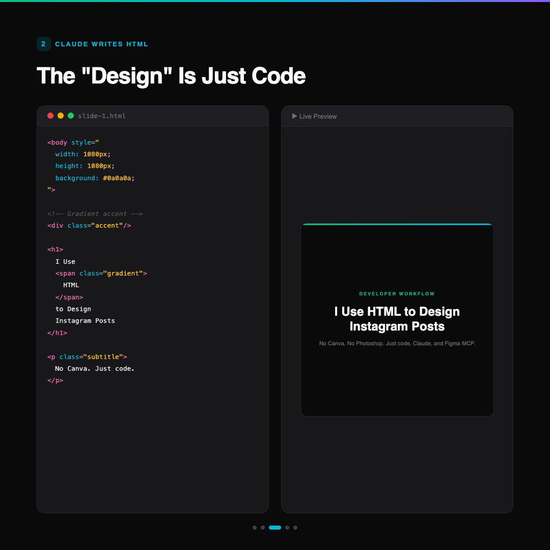
The HTML for a single slide looks something like this:
<body style="
  width: 1080px;
  height: 1080px;
  background: #0a0a0a;
  font-family: 'Inter', sans-serif;
  display: flex;
  flex-direction: column;
  align-items: center;
  justify-content: center;
  padding: 80px;
">
  <div class="accent-line"></div>
  <span class="tag">Developer Workflow</span>
  <h1>I Use <span class="gradient">HTML</span>
      to Design Instagram Posts</h1>
  <p class="subtitle">
    No Canva. No Photoshop. Just code.
  </p>
</body>
That's it. CSS handles the gradients, the typography scale, the spacing, the dark theme. It's not a wireframe — it's the final design. When you open this file in Chrome, what you see is what gets exported.
Why This Works Better Than You'd Expect
Version control. Every slide is a file. Every change is a git diff. I can roll back to Tuesday's version of slide 3 without thinking about it.
Batch generation. "Generate 5 slides following this structure" is a single prompt. Claude produces all five HTML files in one response. Try that in Canva.
Consistency. Same CSS variables, same font stack, same color palette, same spacing scale — across every post, every week, forever. No "which template did I use last time?" The stylesheet is the template.
Speed. A complete 5-slide carousel takes about 10 minutes from "I have an idea" to "I have 5 PNGs in my export folder." Most of that time is the planning conversation, not the design.
The Screenshot Step
The HTML-to-PNG conversion is one line of automation. Playwright (the browser testing framework) renders the HTML at exactly 1080x1080 and exports a PNG:
const browser = await chromium.launch();
const page = await browser.newPage();
await page.setViewportSize({ width: 1080, height: 1080 });
await page.goto('file:///slides/slide-1.html');
await page.screenshot({ path: 'export/slide-1.png' });
Five slides, five screenshots, done. The output is pixel-perfect because it's a real browser render — not a design tool's interpretation of what the browser would do. The fonts are real. The gradients are real. The anti-aliasing is real.
Step 4: Send to Figma via MCP
Here's where it gets interesting.
Most of the time, the HTML output is good enough to post directly. But sometimes I want to fine-tune something that's faster to do visually — nudge a text block, test a different font weight, see how the slide looks next to existing posts in my grid.
That's where Figma MCP comes in.
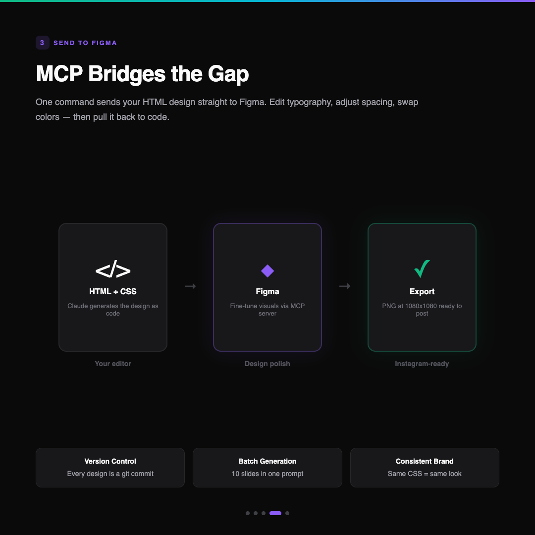
The Figma MCP server lets Claude Code push designs directly into Figma. One tool call captures the rendered HTML and creates it as a Figma frame. From there, I can:
- Adjust typography — test different weights, sizes, line heights visually
- Tweak spacing — sometimes 80px padding looks right in code but feels wrong on mobile
- Check the grid — see how this post sits next to the last three in my Instagram profile
- Export variants — different crops, story versions, square vs. portrait
The key word is "fine-tune." I'm not redesigning in Figma. I'm polishing. The creative work happened in the Claude conversation and the HTML generation. Figma is the last 5%.
Step 5: Bring It Back From Figma to Code
The loop closes. If I make meaningful changes in Figma — say I discover that a 48px heading works better than 44px, or that the gradient looks better at a different angle — I can pull that context back into Claude Code using Figma's get_design_context tool.
Claude reads the Figma frame, sees what changed, and updates the HTML template to match. The code stays the source of truth, but it learns from the visual adjustments.
This matters for consistency across future posts. If I bump up heading sizes in Figma because they looked too small on mobile, that change propagates to the HTML template. Next week's carousel automatically inherits the improvement.
The Full Carousel
Here's what came out of this exact workflow — the five slides I used as examples throughout this post:
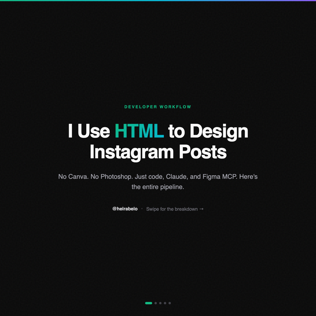
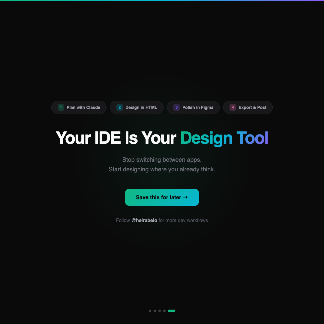
One conversation. Five HTML files. Five PNGs. Zero design tools opened during creation.
Why This Pipeline Exists
I'm going to be honest about the origin story.
I didn't build this workflow because I'm a productivity optimist or a "hack your workflow" content guy. I built it because I'm a developer who needs to post on Instagram and the existing tools made me not want to.
Canva requires context-switching. You leave your editor, open a browser tab, navigate a GUI, drag things around with a mouse. For someone who thinks in code, that's friction. Not impossible friction — but enough friction that "I should post something today" turned into "I'll do it tomorrow" turned into three weeks of silence.
HTML doesn't have that friction. I'm already in the terminal. I'm already talking to Claude. "Also make me an Instagram carousel about this" is a natural continuation of my workflow, not an interruption.
The Figma MCP part was the final piece. Before that, the HTML-to-PNG pipeline worked but felt disconnected from the design world. MCP connected the two. Now I can move between code and design as fluidly as I move between frontend and backend.
Tips If You Want to Try This
Start with a template
Don't design from scratch every time. Build one dark-theme template with your brand colors, font stack, and spacing scale. Claude can generate variations from that base forever.
Use 1080x1080 for squares, 1080x1350 for portrait
Instagram's two most reliable formats. Set your body width and height accordingly. Portrait gets more screen real estate in the feed.
Keep the CSS simple
You're not building a web app. No media queries, no responsive breakpoints, no JavaScript. Just static visual design in a fixed viewport. CSS Grid and Flexbox are your layout tools. That's it.
Export at 2x if you want crisp text
Playwright's scale: 'device' option renders at 2x resolution. The file is larger but the text is noticeably sharper on high-DPI phone screens.
Version control your templates
Put your slide templates in a git repo. Track what works. When a post does well, you know exactly which template, color scheme, and structure to reuse.
The Shift
Content creation used to be a separate discipline from development. Different tools, different skills, different mental mode. You'd write code all day and then switch to "creative mode" to make a social media post.
This pipeline dissolves that boundary. The creative work — the content planning, the visual design, the brand consistency — happens inside the development environment. With the same tools. In the same flow state.
That's not a productivity hack. It's the removal of an artificial barrier between two things that were always the same skill: making things that communicate clearly.
Your IDE is your design tool. You just hadn't used it that way yet.